| Author | Message | ||
Patrick Ryan Grand Master Username: patrick_r Post Number: 1529 Registered: 4-2016 |
Good Morning Gents, This is one of our local auto news sites, that has great up to date info on all things automotive in Australia. It is actually a great read every week and its free. In this weeks edition, it announces the yearly award of Rolls-Royce dealer of the year. Plus various country dealer awards. What I found interesting is the trophy. Is this the first time we have ever seen an official reworking, or re imagining or alteration of the famous mascot? Of course over the years it has been reworked very subtlety, but still remains true to its original. I have to admit, I have not seen this done before. Or have I been living under a rock? http://premium.goauto.com.au/brit-pops-rolls-royces-best-dealer/ 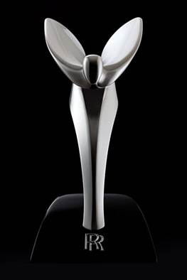 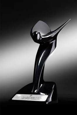 | ||
ross kowalski Grand Master Username: cdfpw Post Number: 426 Registered: 11-2015 |
Patrick, Interesting, but I must say I am a bigger fan of the original. | ||
Patrick Ryan Grand Master Username: patrick_r Post Number: 1533 Registered: 4-2016 |
Definitely Ross. I can't imagine what dealer or salesman wouldn't want an original mascot on their trophy. This thing is terrible. | ||
ross kowalski Grand Master Username: cdfpw Post Number: 427 Registered: 11-2015 |
At least the trophy mascot was designed by RR. Here's geely's try at it. 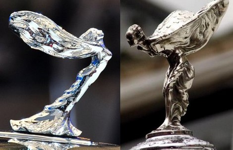 | ||
Brian Vogel Grand Master Username: guyslp Post Number: 2296 Registered: 6-2009 |
Well, I'll be the contrarian. While I love the original Spirit of Ecstasy, and always will, I find the streamlined version equally striking in its own way. It certainly seems more in keeping with a modern automobile. The lines are sleek and the lineage is obvious. Brian | ||
David Gore Moderator Username: david_gore Post Number: 2560 Registered: 4-2003 |
Brian V, I am with you - I also see an Art Deco influence. Modern yet traditional - I like it immensely but for a modern vehicle and not a classic/historic R-R vehicle. | ||
Patrick Francis Prolific User Username: jackpot Post Number: 118 Registered: 11-2016 |
I like it! I also love the old one - but horses for courses - On the right model it will suit. It will look strange until you get used to it. Have a look at this as a matter of interest. I always thought Fiat's latest logo change was the best thing they have done lately. (FIAT stands for Fix It Again Tony) I own "the ugliest car in the world" - a Fiat Multipla - and I love it.. http://www.neatorama.com/2008/02/18/evolution-of-car-logos/ | ||
Patrick Ryan Grand Master Username: patrick_r Post Number: 1534 Registered: 4-2016 |
I'm glad some people like it  |